RH Logic redesign
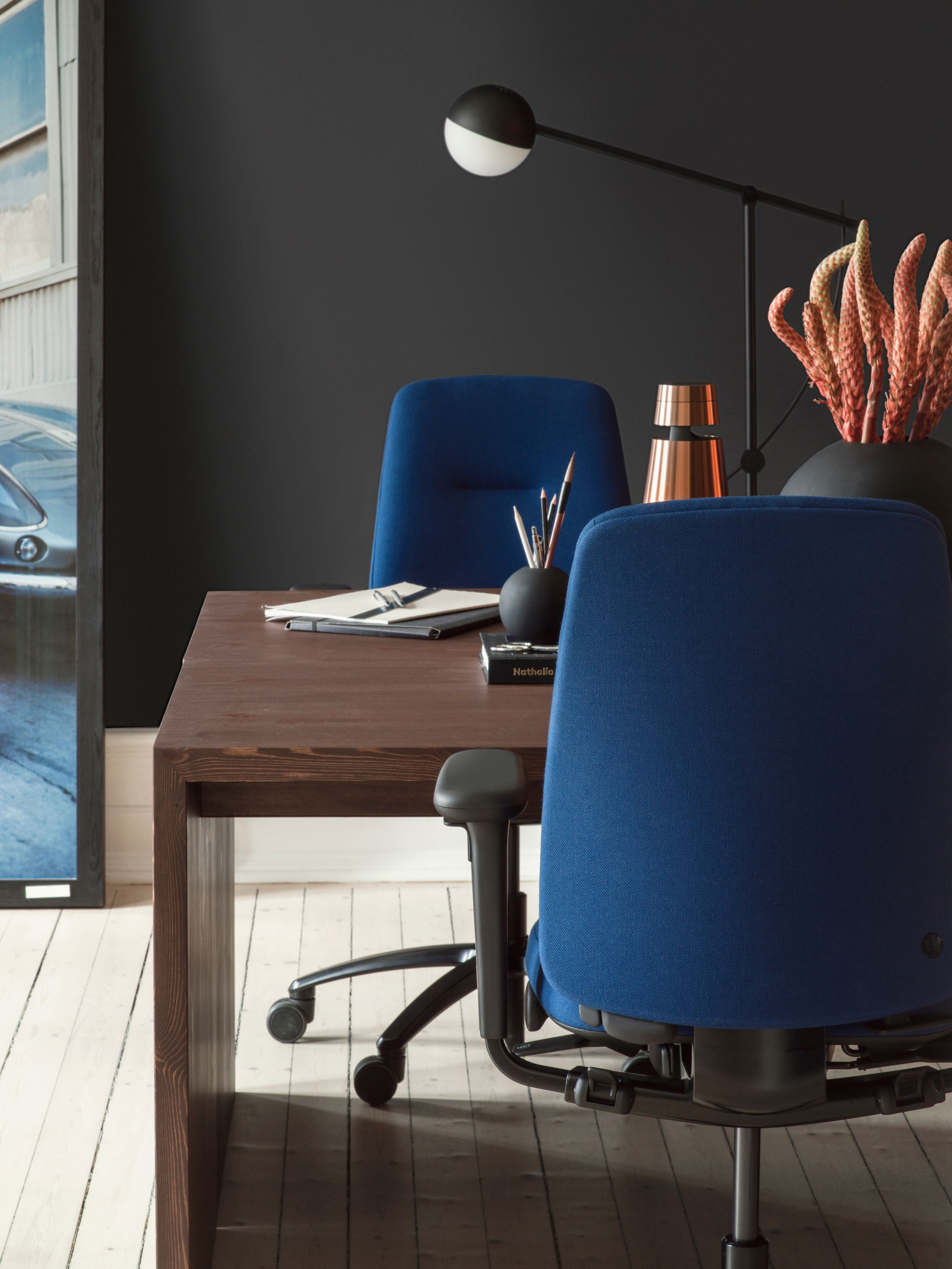
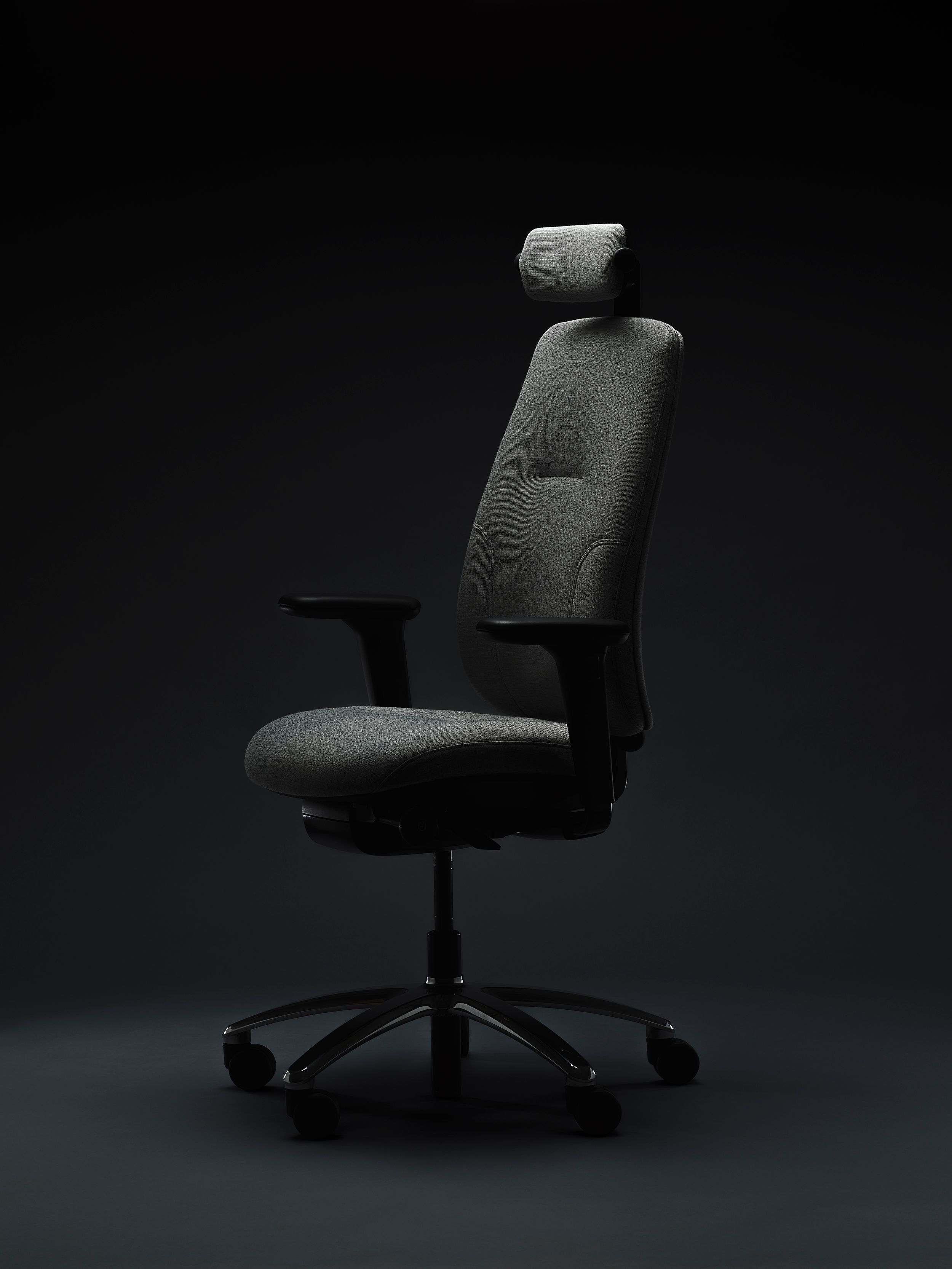
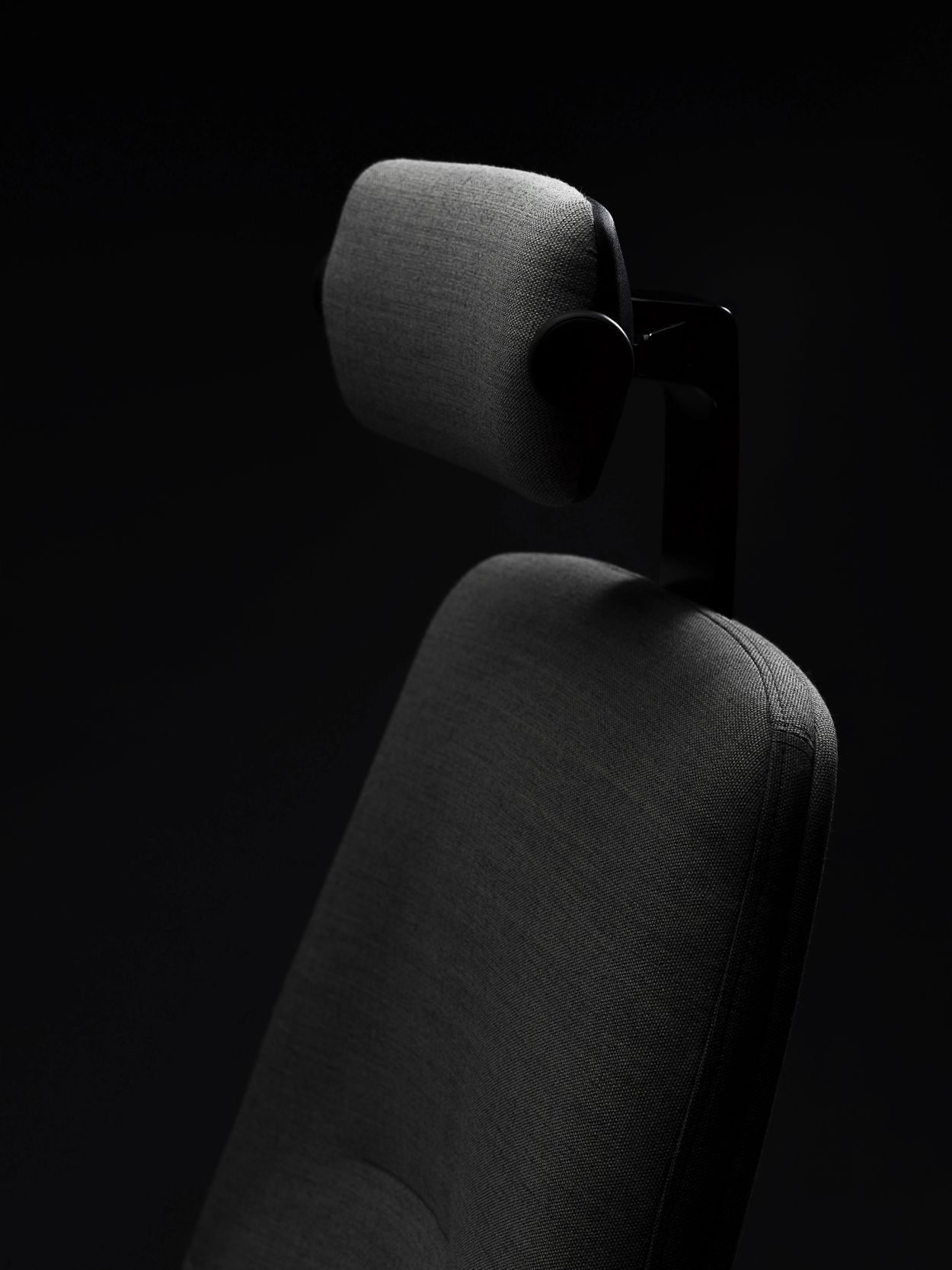
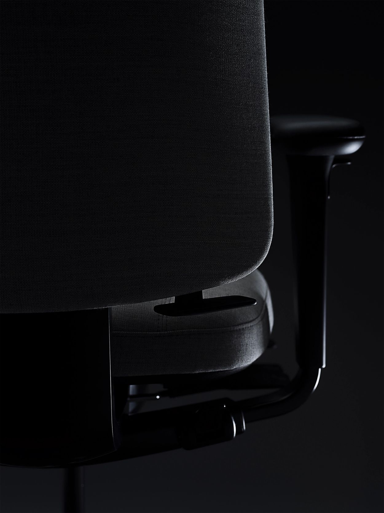
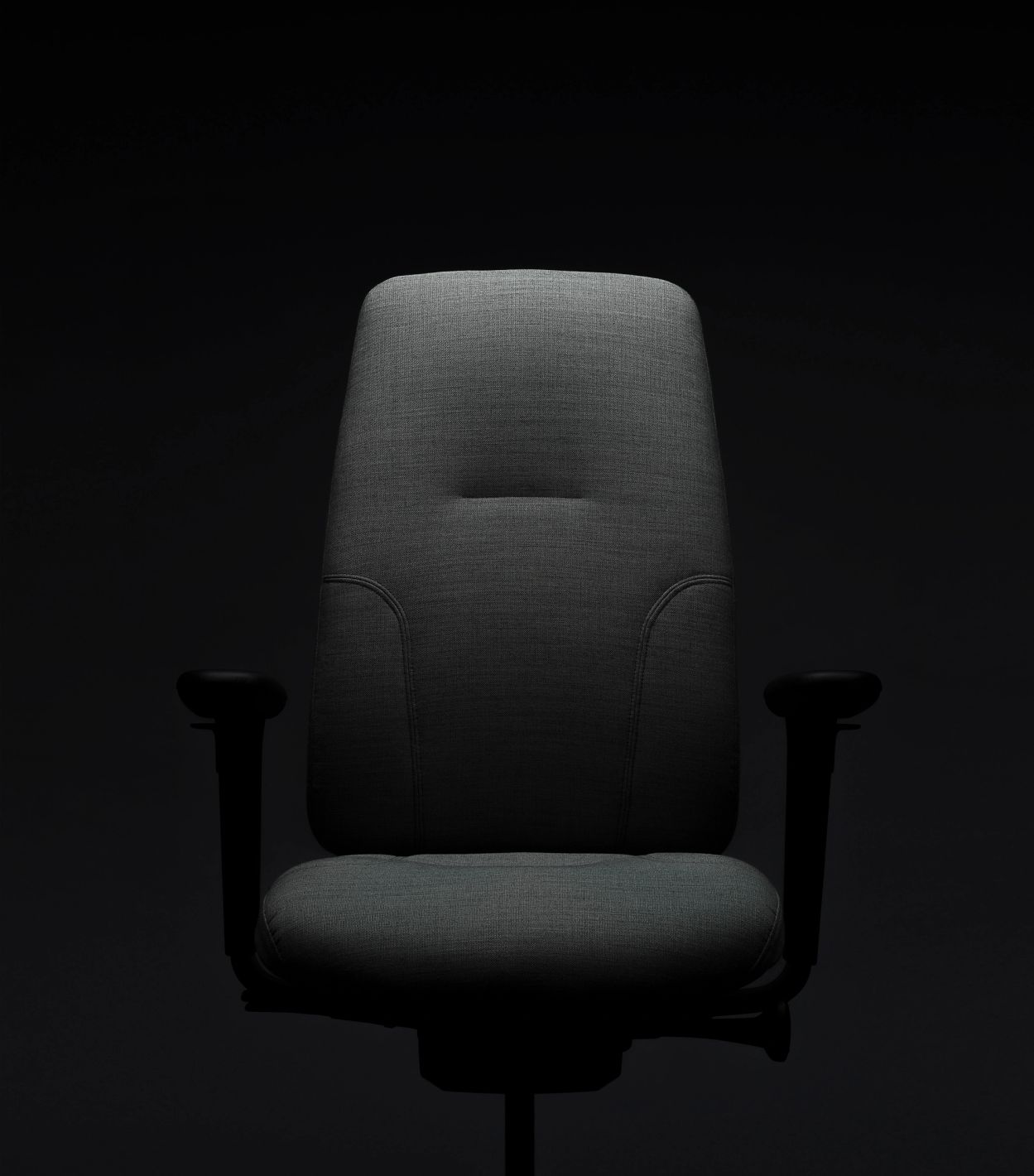
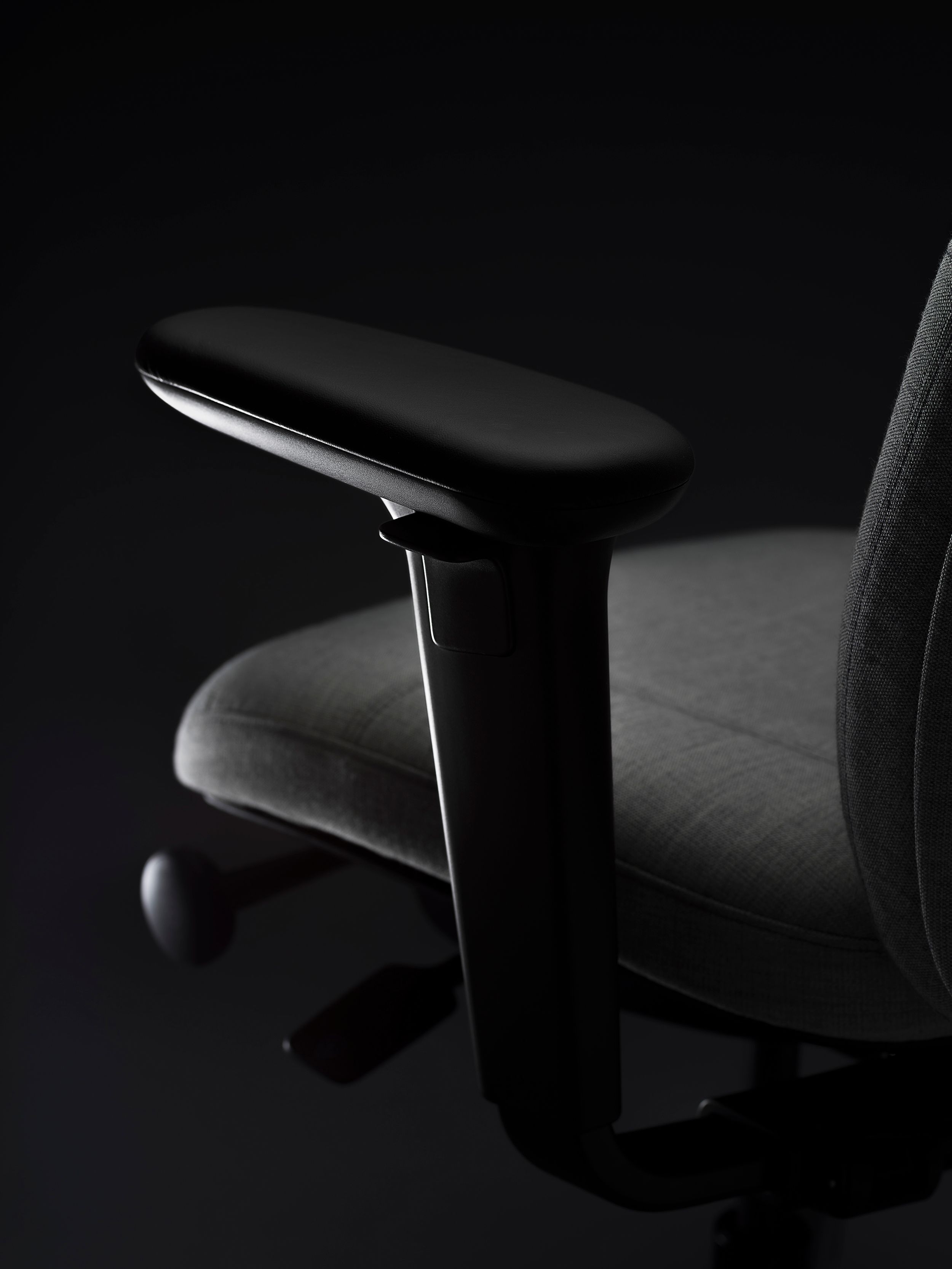
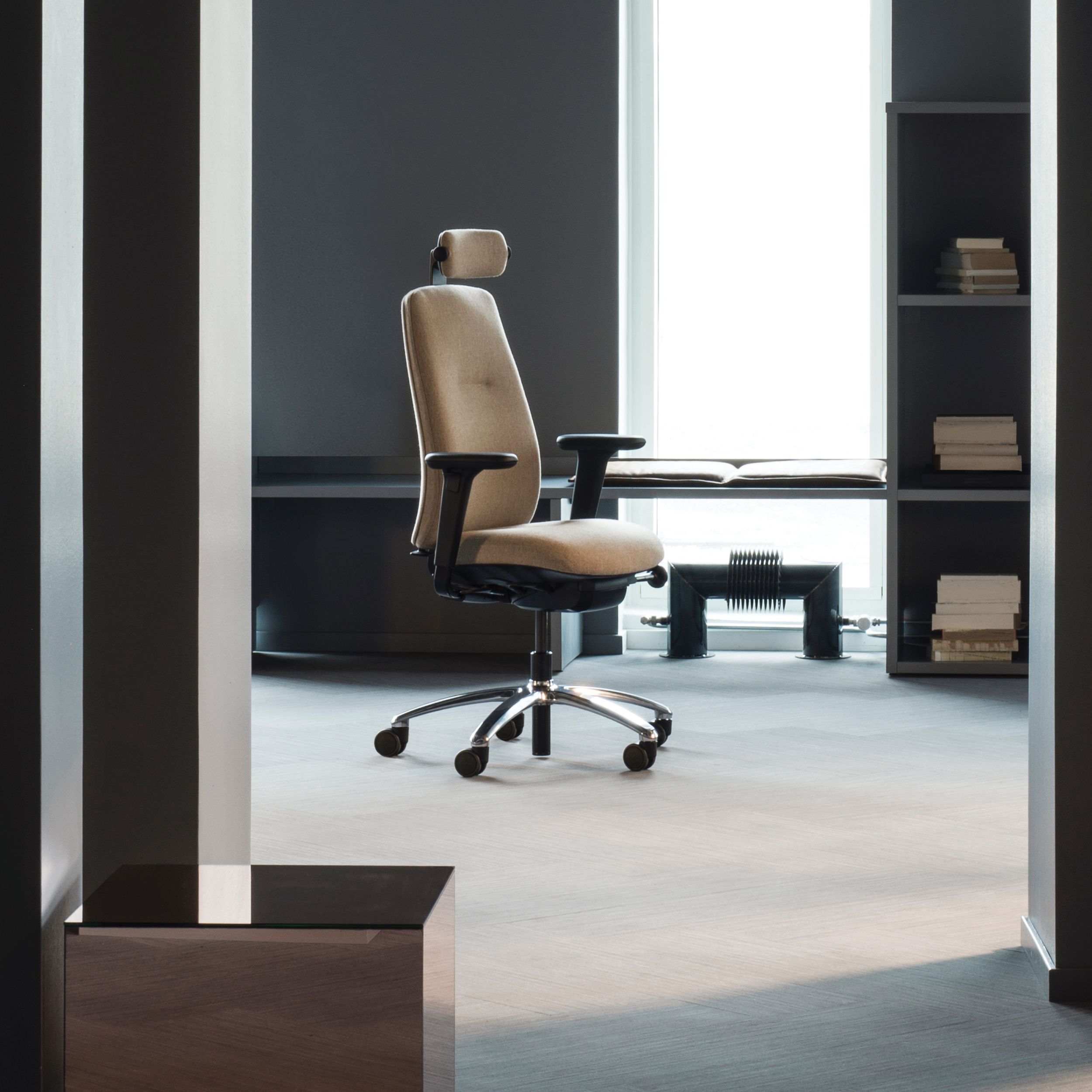
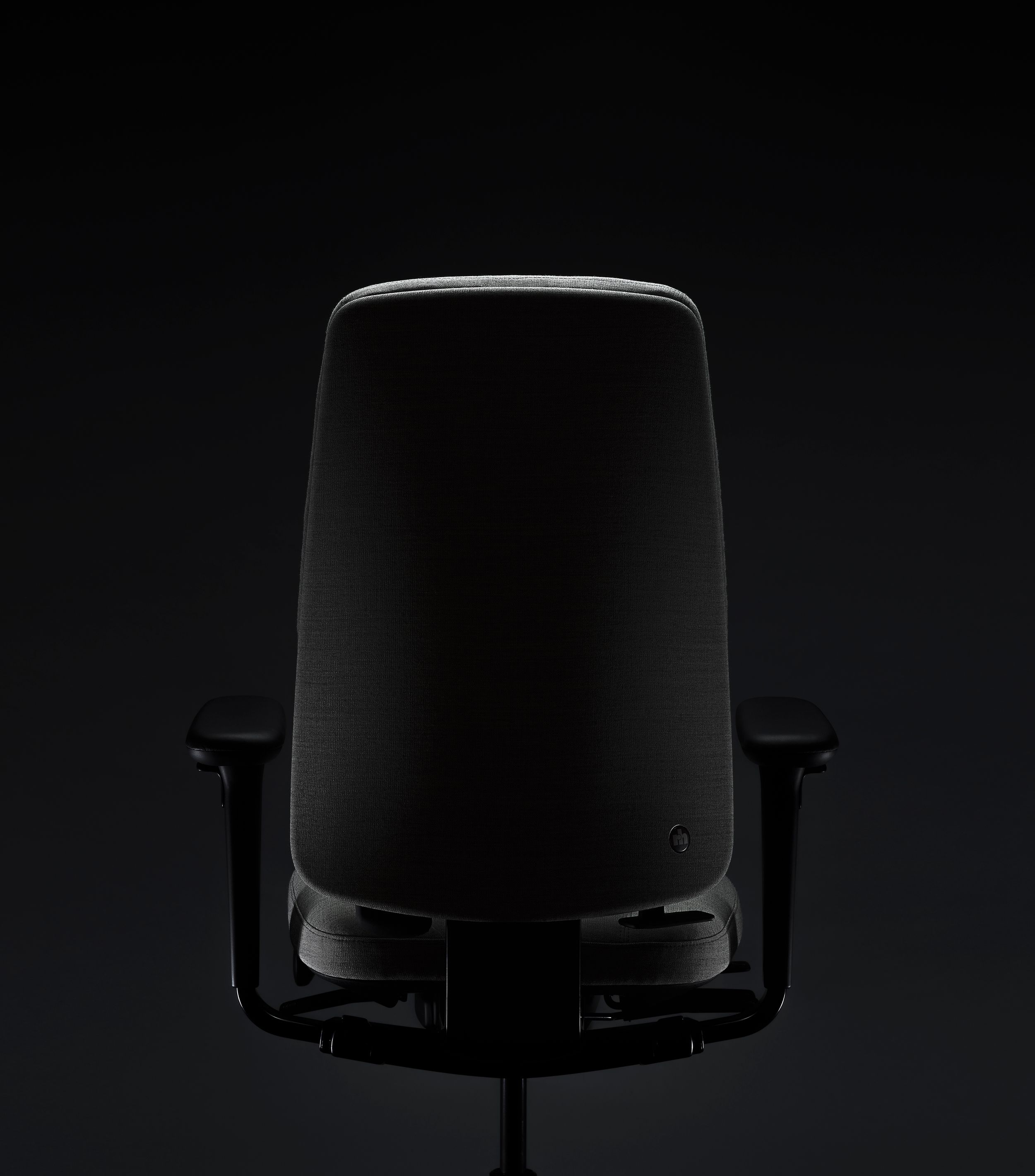
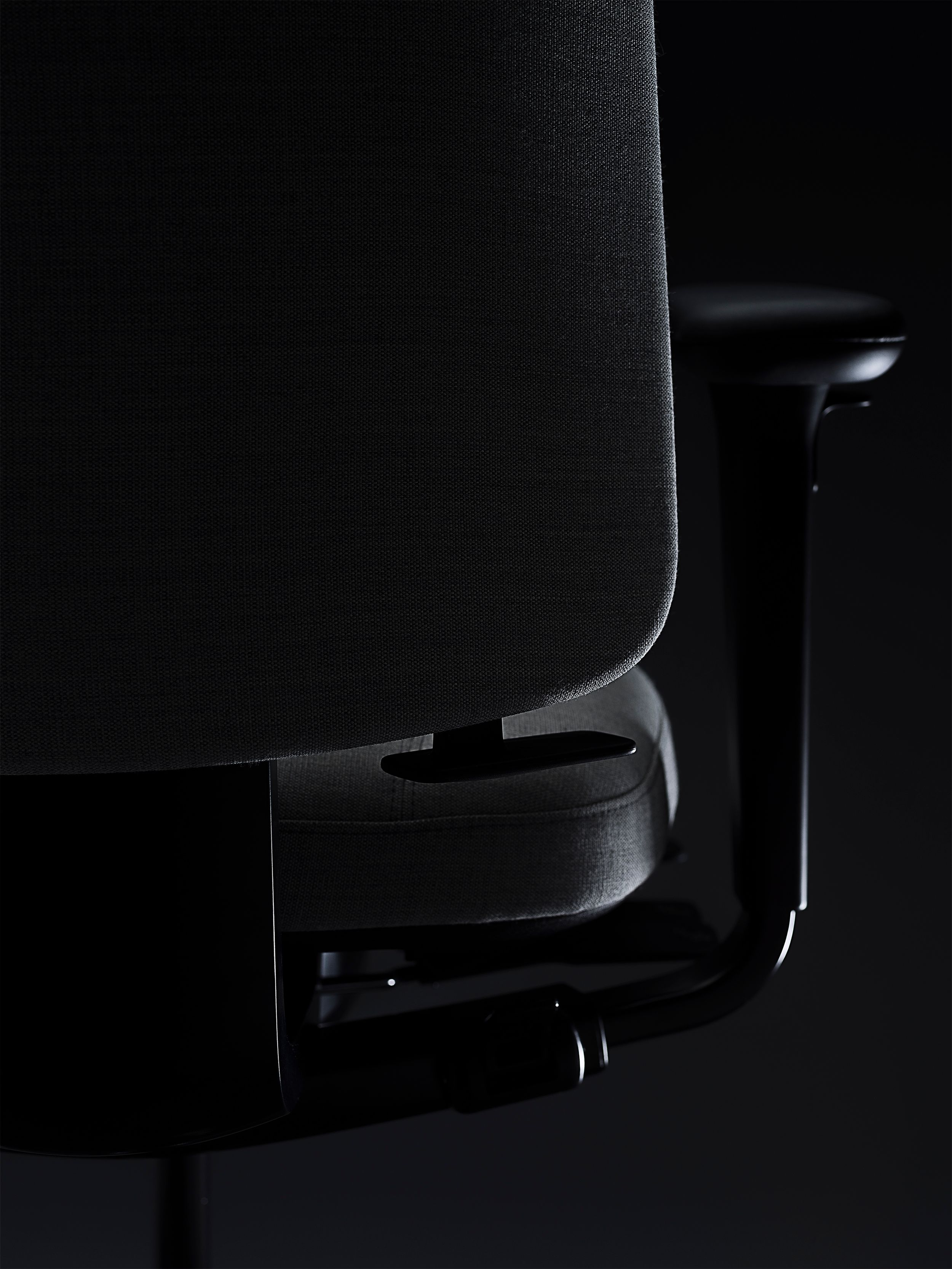
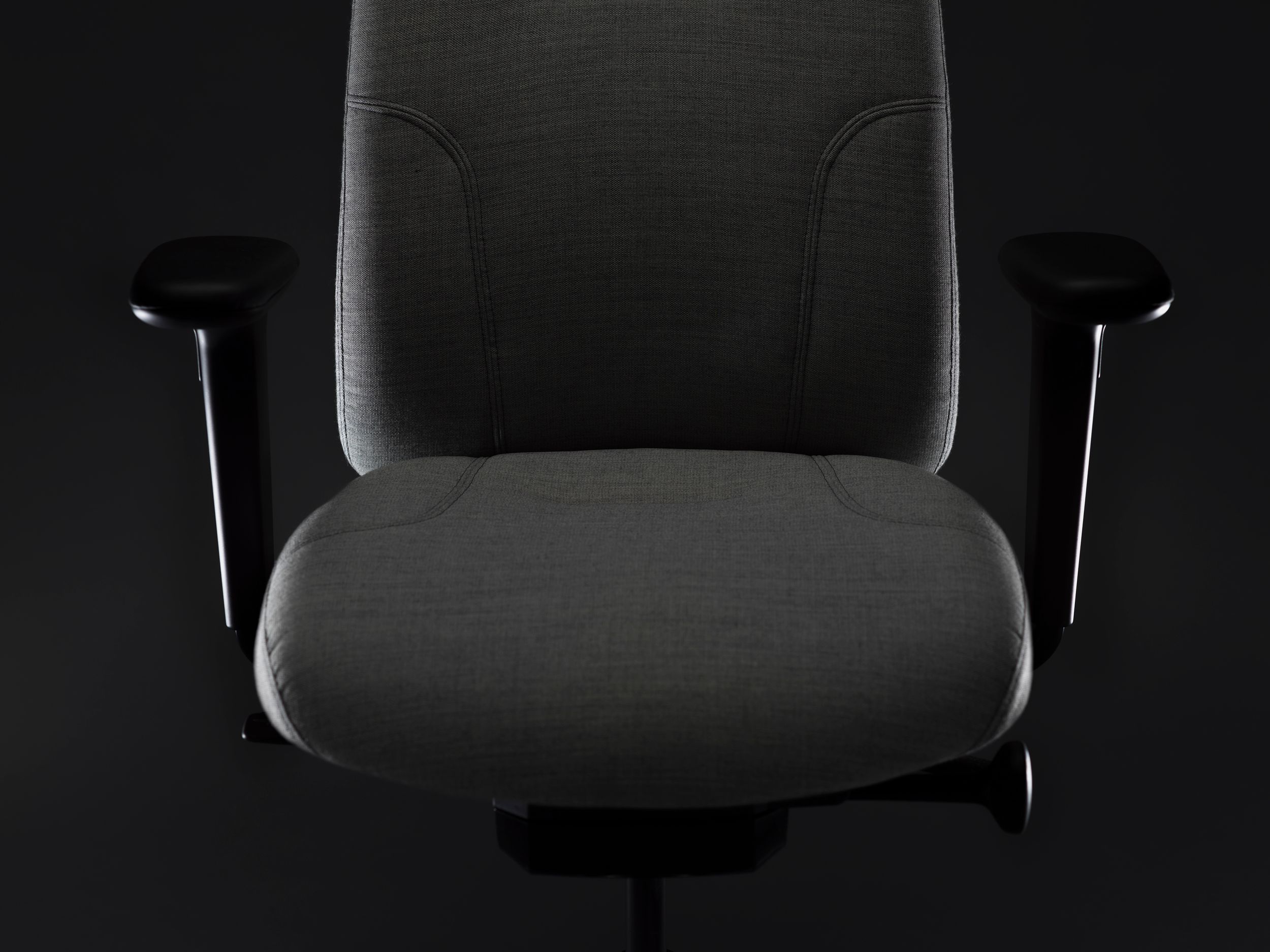
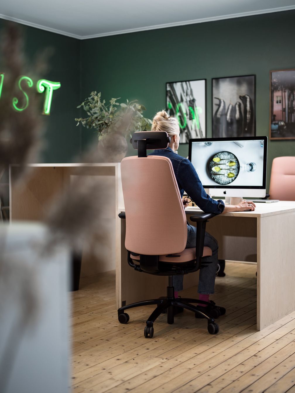
Redesigning a bestseller that is responsible for the lion's share of the turnover for an office furniture giant, is not for the faint of heart. We could not touch the base and had to keep all the functionality. A total of 18,000 (!) manhours went into the project including ours and the client's internal hours. This chair is what we call a 24/7- meaning it is always occupied by a human. Typically in emergency response centers, security areas, and crucial business functions. The biggest challenge was keeping all the functionality and the hyper-ergonomic seating surfaces while making it aesthetically appealing. Or as the client themselves described it in the brief: keep the architects from running screaming from the room!
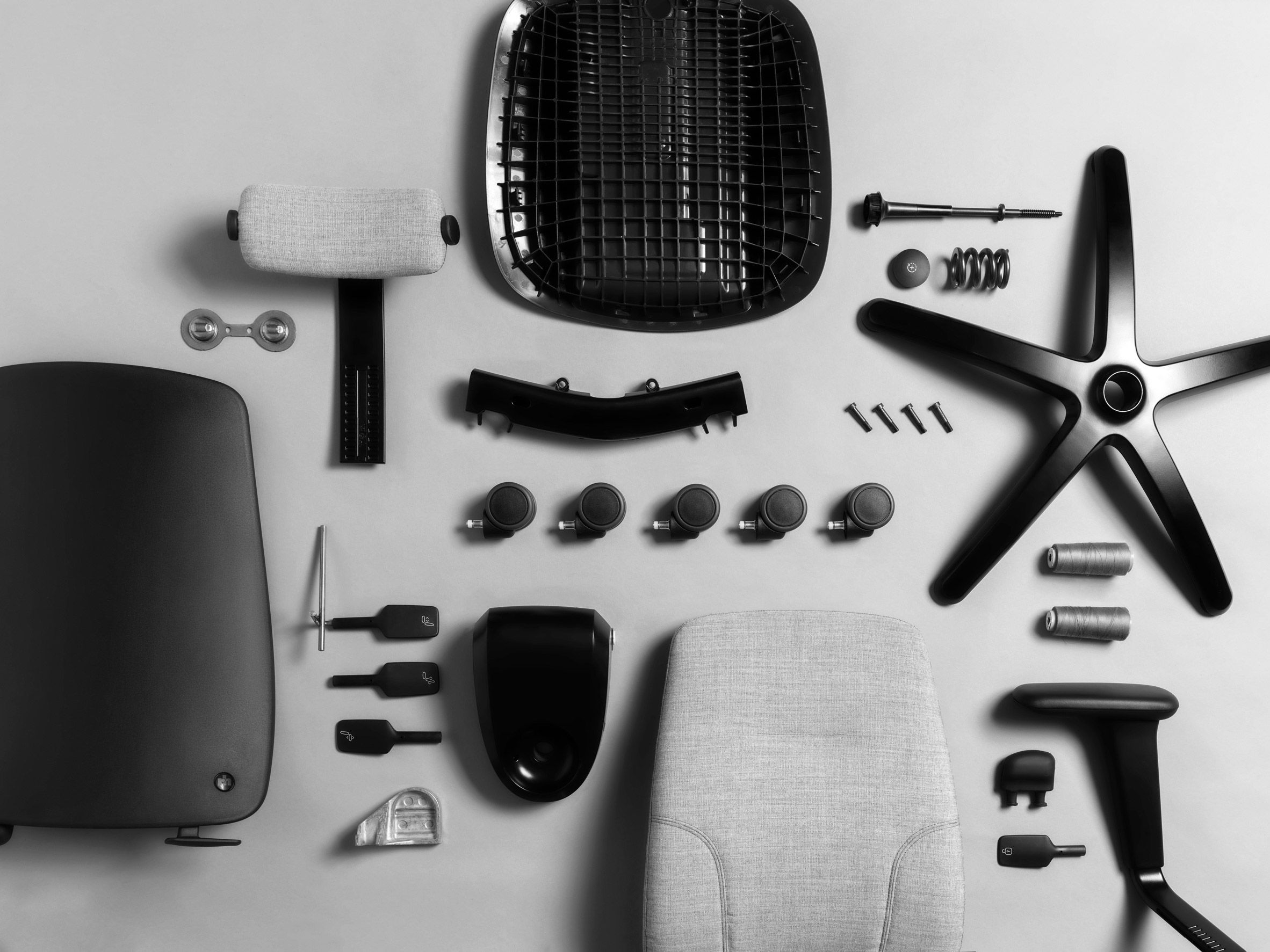
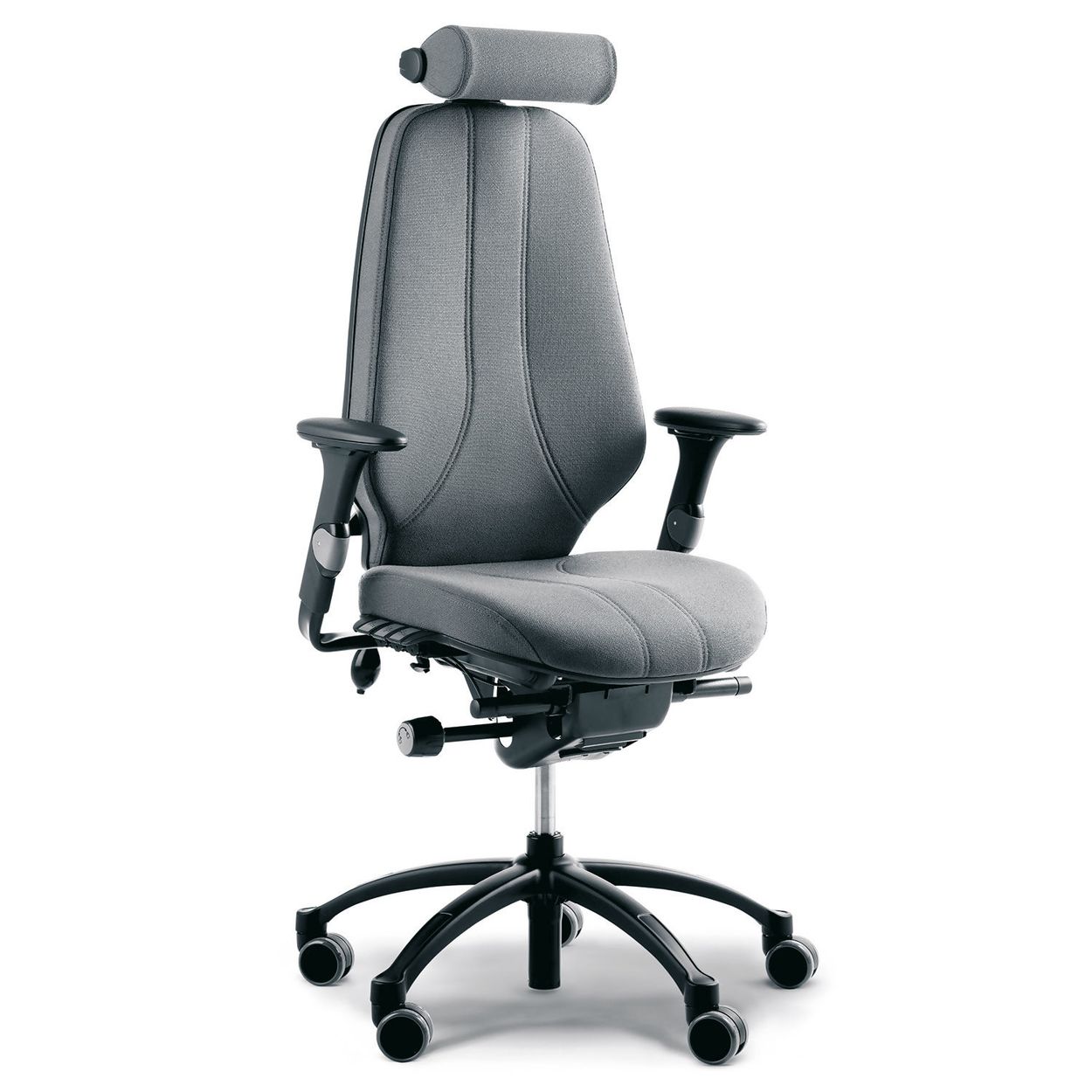
The old RH Logic had been a bestseller for decades, due to its unrivaled performance. In the UK this chair was prescribed by doctors for people with back problems. But as sales started to plateau and threats came from new places the product needed a redesign. Not at least to try to soften the architects who would actively work against the chair on projects. The trick then was to convince the client that the strength of the chair was in its functionality- not the appearance, despite claims of it being recognizable, and customers reporting they liked the way it looked.
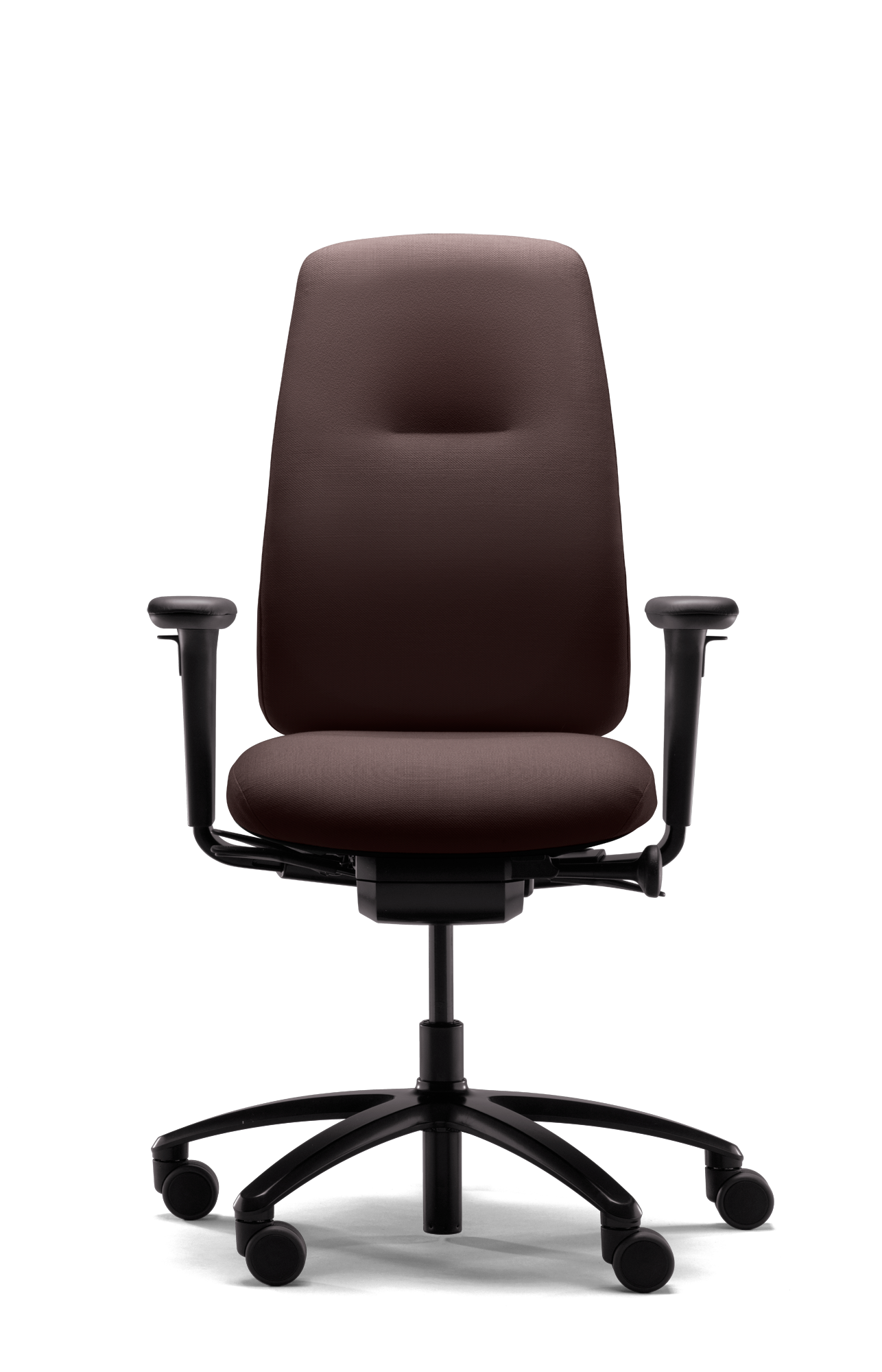
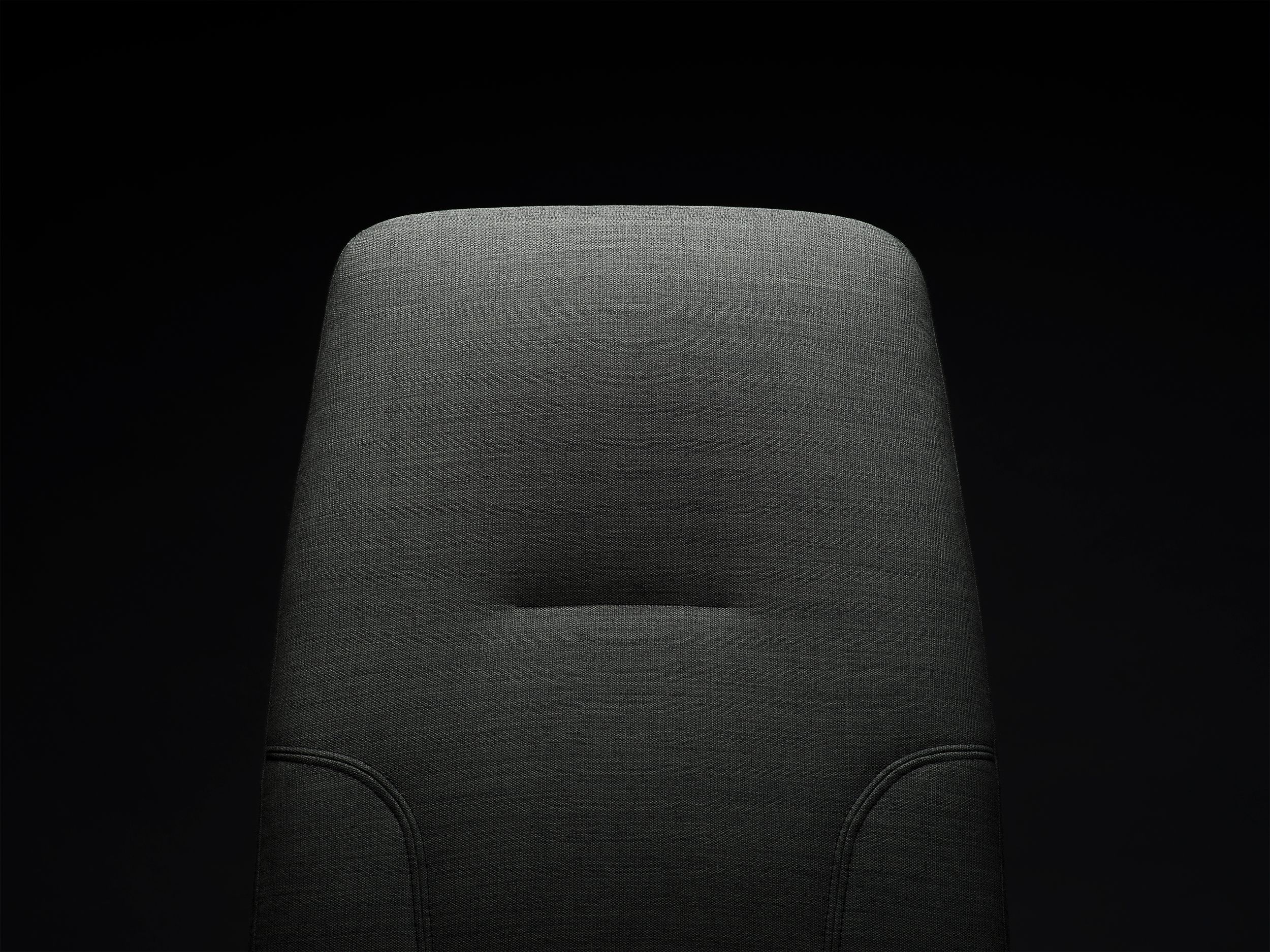
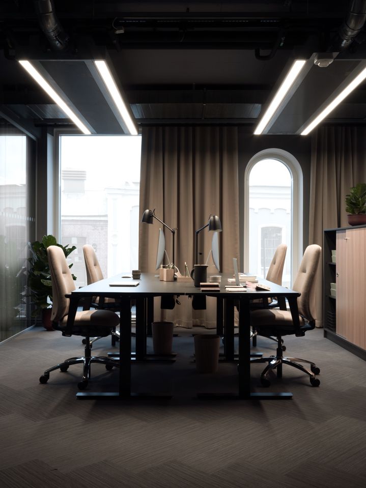
- Year: 2017
- Manufacturer: Flokk / RH
- Collaborators: Øysein Austad, Flokk Design team
- Materials: Steel, polypropylene, aluminium, upholstery, mechanical fasteners
- Photos: Flokk
- Assistants: Nina Havermans
